MEGHAN AND JASON'S MAIN FLOOR (yup, the entire thing except the powder room) ...
This past spring I was at a networking event where I met Jason ... we had a few things in common (a past job of mine and his current career) and got along quite well.
In the summer I received an email from him asking if I could give his wife (Meghan) a call as her parents were moving to Ottawa from Southern Ontario and I could I be their Realtor(R) ... of course I said yes! Meghan and I hit it off right away, we spent a lot of time together as she was the go-between for her parents and "head house hunter" for them. Long story short ... they bought a lovely house with me and all was well.
Late in the fall I decided that it was time for me to leave my career in real estate and pursue something where I could release my creative energy ... PAINTING! It's something I'm good at and thoroughly enjoy. As per usual, I posted the pics on my Facebook to let my peeps know what I was up to and booked some jobs through that (and Twitter) and word of mouth. Meghan and Jason saw some of the pics (and had been thinking of painting for some time) so they decided to give me a shout and hire me for the job. Meghan and I were on the same page from day one ... we emailed pictures and comments back and forth for a week or so, decided what exactly was to be done. The entire main floor was painted a caramel colour with beige ceilings and a faux finish on the family room walls ... it was very somber (like a funeral home!) and Meghan and Jason wanted to brighten it up to suit their personalities!
Here are the results ... hope ya like em!
 |
| Meghan loves the jewel tones of peacock feathers ... and who can blame her! So gorgeous! |
 |
This painting was on the living room wall and I fell in love with it the moment I set eyes on it!
The artist is BEVERLY FISH, Meghan's aunt. It's whimsical, bright and sparkly! The stars in the sky are
SWAROVSKI crystals! Can you say GLAM?! |
 |
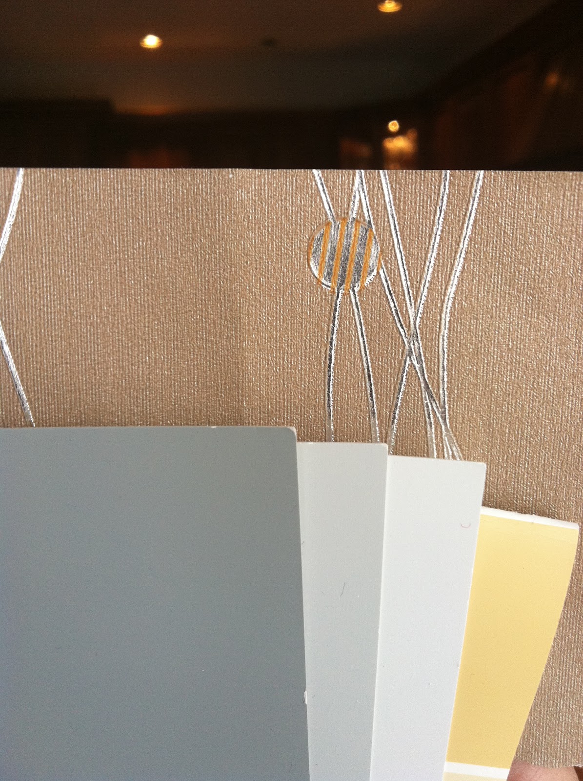
Colours and wallpaper picked! Ok so you're probably thinking "hey, these aren't peacock colours" ... just wait!
The wallpaper was ordered from HOME DEPOT.
Paint purchased at SHERWIN-WILLIAMS ... a huge thank you to Jeremy and Ryan the Innes location!
Colours seen here: Earl Gray (dining room walls),
Tinsmith (entrance, hallway, living room, kitchen and family room walls),
Rhinestone (entrance, hallway, kitchen and family room ceilings)
Humble Gold (living room and dining room ceilings) |
 |
| The front entrance ... boring! The beginnings of a brightening it up and making it a more welcoming. |
 |
Meghan and Jason's oldest daughter, Emilie (yes, I spelled it wrong in the pic!) was a big help the day I was working on the front entrance closet. Seriously, she was - I must give credit where credit is due!
Always remember to paint the inside of your closets ... no one likes a half-assed job! |
 |
| This funky light fixture holds the high space between the door moldings and the ceiling better than the flush-mount light that was there originally ... and adds some good energy to the space too! |
 |
Bright and welcoming! The table was originally black ... I spray painted it a hammered copper, a new IKEA mirror was added, doors painted Fox Black with some new hardware bling!
A big shout out to LISA GOULET for her inspiration to paint interior doors dark colours!
So much richer looking than plain old white! |
 |
| View of the entrance from the living room. |
 |
| EVERY room needs a little bling ... even the front entrance! |
 |
| Gloomy stairway ... |
 |
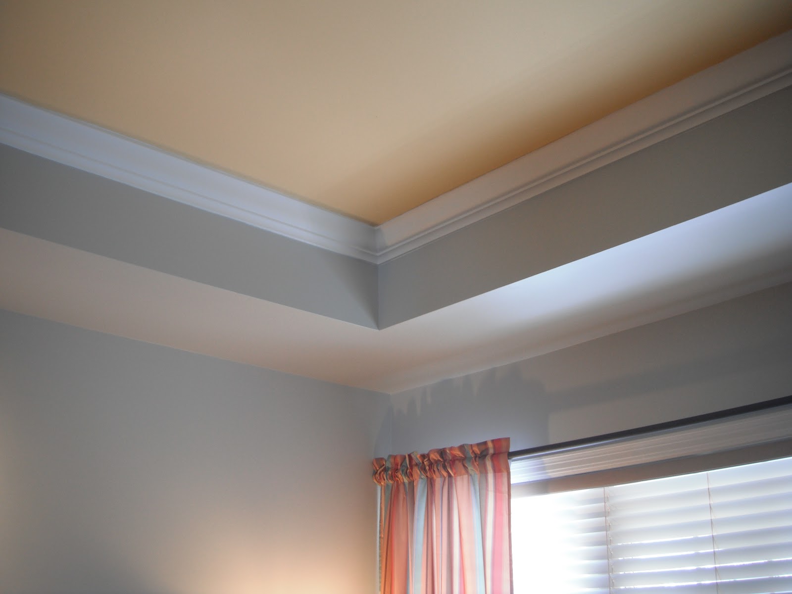
The upper landing is so bright and fresh! I cannot take credit for this though!
Bill Vail, owner of VAIL RENOVATIONS gave me a hand ... he was kind enough
to paint the entire stairway (wall, crown and ceiling). |
 |
| The hanging light was barely noticeable before everything was painted! Now it really suits the space! |
 |
The kitchen (before) was already gorgeous, however it is attached to the family room which
was not really Meghan and Jason's taste at all. |
 |
Here is the long wall attaching the kitchen and family room. The faux finish just had to go!
Also, check out the IKEA TV stand ... I had something special in store for that!
Oh, hi there MIKE HOLMES ... yes, we're making it right ;) Perhaps you should hire me! |
 |
With the ceiling painted Rhinestone and the walls Tinsmith they really brightened it up!
The back splash is a soft gray mottled design tile with darker gray grout and the counter tops are a charcoal ...
so the colours we chose complimented them well! |
 |
The family room furniture layout was not very functional as the first thing you saw when you walked
in the front door was the big TV staring at you from the other end of the house. Not very good Feng Shui!
Easy solution to that though ... Meghan and I worked out a better layout. |
 |
| Another view of the family room. I love the on site finished hardwood throughout the entire main floor! |
 |
Patching, sanding, painting ...
BILL VAIL also painted the ceiling in the family room, a few spots above the kitchen cabinets
where my short Oompah Loompah arms couldn't reach! |
 |
| Painting finished, wallpaper installed, furniture rearranged = happier, functional room! |
 |
Meghan and Jason purchased this chest of drawers from IKEA (added some artwork and accessories) ...
now this is what you see at the end of the hallway when you enter the house! Much nicer than the TV, eh?! |
 |
| There ain't no such thing as too much bling! |
 |
Remember the IKEA TV stand a few pictures back?
The pillows were the jumping off point for the colour choice! A really nice green/gold! |
 |
In the dining room you'll notice another fab original painting by BEVERLY FISH.
Brown chairs, brown marble table, brown walls, beige ceiling ... blah! |
 |
I paint the crown molding in a FLAT bright white (years ago they were originally plaster) ...
besides, having a glossy sheen up by the ceiling just isn't right!
Ceiling is painted in a flat ceiling paint (Humble Gold) ... it looks like velvet with the flat white crown!
Cutting for the walls done in Earl Gray ... looking faboosh already! |
 |
The marble table was too heavy to move so I covered it in plastic ...
reminded me of a "Dexter kill room" ... only fancier :) |
 |
View from the living room ...
curtains are a gorgeous teal with embroidered gold and orange peacock feathers from PIER 1 IMPORTS |
 |
This little cheeky monkey was so happy to be able to motor without baby gates barricading her in ...
she just had to rush to maul the glass curio with her goobery fingers!
Sophie, I think your parents could be spokespeople for Windex! |
 |
Another piece of furniture that got a facelift!
This bar unit was stained out about the same colour as the kitchen cabinets.
I painted it a marigold orange for a big pop of colour in the dining room.
The racks were spray painted silver and the back was wallpapered with a cream/silver floral print (leftovers from a previous decor project of Meghan's).
Lovin' the peacock feather wreath! |
 |
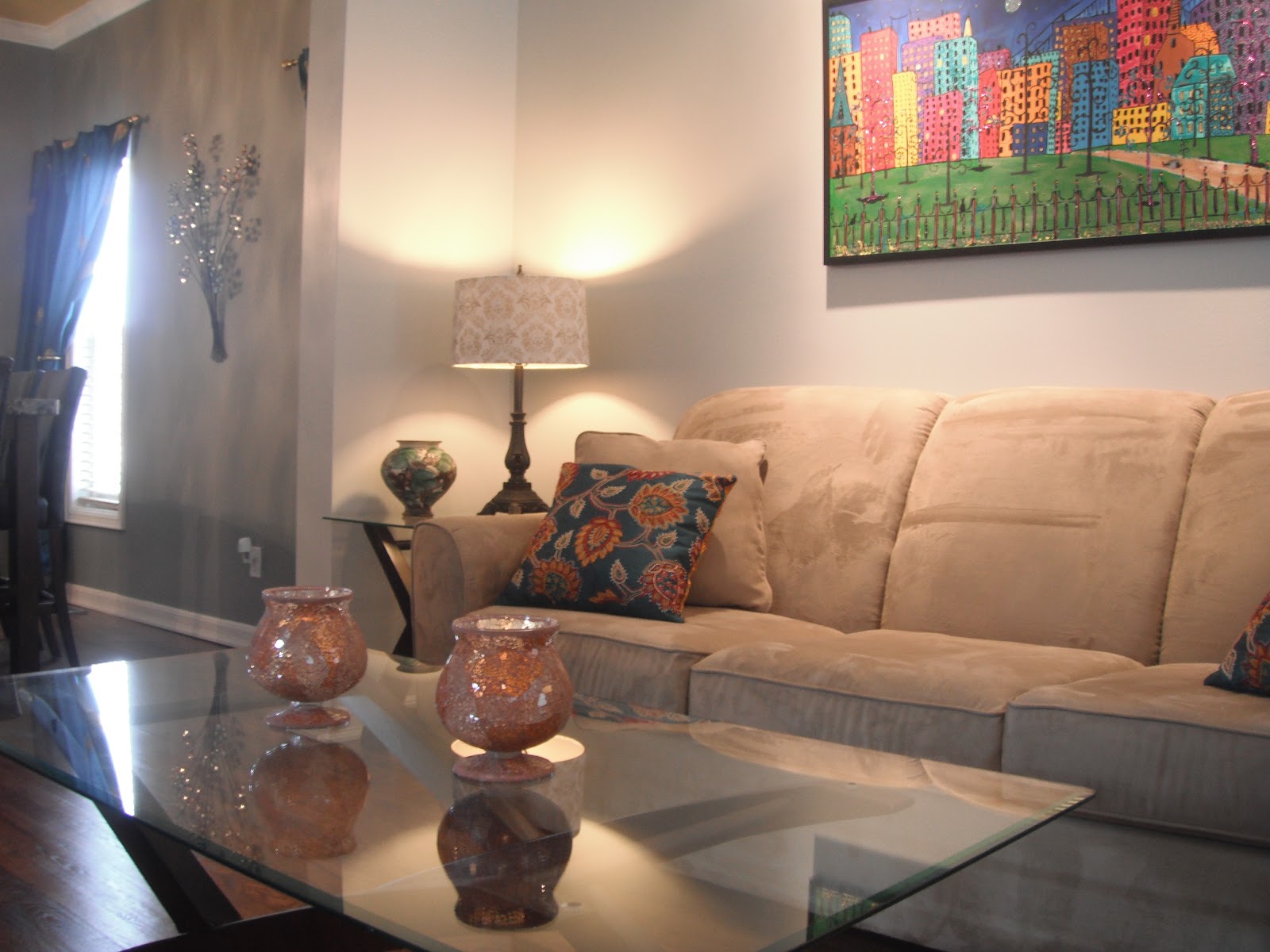
Living room ... beige, brown, caramel ... blah, blah, blah!
Since the furniture is a goldish/beige it just had no presence in the room. |
 |
| The beige walls really don't compliment the artwork. |
 |
Living room DONE - Jason and his Dad painted the walls over a busy weekend.
The curtains are a multi-stripe pattern (with most of the colours in the painting)
from PIER 1 IMPORTS. |
 |
| Pillows from PIER 1 IMPORTS look great with the curtains and painting - love little pops of colour! |
 |
Meghan mentioned that she really never used her living room for anything before.
I think it was because it was so bland. I think now that she and Jason love it they'll
enjoy it for entertaining or just sitting and relaxing with a good book and a glass of wine ... |
Ok, so you may be wondering why I called this Project Peacock (aside from the obvious peacock feather wreath and peacock themed curtains in the dining room) ... well, Meghan's original thought was to paint the ceiling in the living and dining rooms a deep peacock teal. She sent me a ton of fabulous pictures she found - they were amazing inspiration. During one of our many conversations, she mentioned that she gets tired of accessories easily - this is when I talked her down (and Jason was not sold on the teal). We ended up agreeing on a soft colour that would go well with the grays we chose and pull in some of the tones off the sofa and marble table. Humble Gold was the winner. We agreed that the main ceiling and wall colours should stay neutral so she can easily change up her window treatments and accessories without a lot of cost being incurred ... fun splashes of colour will add a lot of impact. Maybe when they're ready for the master bedroom to be done it'll be a different story!
SPECIAL THANKS TO ...
Paint was purchased through Jeremy Sumner from
SHERWIN-WILLIAMS Paint on Innes Road, Orleans.
Accessories, furniture pieces, light fixtures, knobs etc. were purchased at
HOMESENSE,
PIER 1 IMPORTS,
IKEA,
HOME DEPOT,
LOWES and the like.
Original artwork throughout parts of the main floor by artist
BEVERLY FISH.
Shout out to designer
LISA GOULET for the inspiration to paint the interior doors black and to
BILL VAIL for your long reach and support with this project.
A HUGE THANK YOU especially to Meghan and Jason for allowing me to disrupt their lives for 3 weeks!


.jpg)


